Ironhack Challenge 3: Usability Evaluation and Site Redesign

As a former flight attendant, I could not be happier to work on a project about the seven wonders of the world.
For this project I had to jump into the shoes of different user types. I chose to represent an elderly couple Lisa 75 and her husband Charles 79 years old whose dream is to visit Beijing and the Great Wall of China.
I chose a target audience that is most different from me to force myself to empathise. To be able to redesign a website, I had to go through different phases : Research, Benchmarking, Testing and Redesign wireframes.
Let’s explore !
Research :
The Great Wall of China is an ancient wall in China. The wall is made of cement, rocks, bricks, and powdered dirt. It was finished in 1878 and it was meant to protect the north of the empire of China from enemy attacks. It is the longest structure humans have ever built.
A beautiful piece of art where you can feel the rich history and see the beauty of human creation. I can only understand why visiting this wonder is a dream for some.

Lisa and Charles are excited to plan their trip but unfamiliar with booking tickets online and doing research on the internet, it can be challenging for them. But a challenge they are ready to take to plan and prepare their dream trip. They decided to plan their own trip to have flexibility and let the beauty of surprise happen to them.
- Nearest airport : PEK Beijing Capital Airport. It is the primary airport in the city of Beijing where many airlines operate from. It is 66km away from the Great Wall.
- Currency and exchange rate : 1 Euro = 7,99 Chinese Yuan Renminbi
- Medical needs : All travelers should be up to date on routine vaccinations plus the yellow fever vaccination is required when traveling to China.
- Dress code : Dress according to weather. In winter, wearing hiking boots with ice grip soles is highly recommended.
- Days needed to visit : 1 day at the great wall can be enough to feel the magic. It is recommended to spend 5 days in Beijing to discover the capital’s must-see sights.
Benchmarking :
Many travel apps exist to help you plan your travel like Kayak, Skyscanner, Tripadvisor and Hopper. Following the Usability Heuristics evaluation with Nielsen’s Principles I have compared and identified the one that will work best for my user type. A heuristic evaluation is a usability inspection method for computer software that helps to identify usability problems in the user interface design.
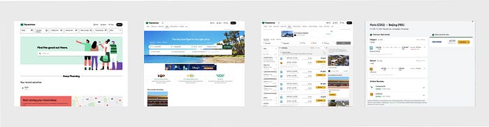
Tripadvisor seems to fit my user expectations. They have access to many information to plan their trip, hotels, activities, recommendations and the freedom to choose their journey.
Testing :
In this phase, I performed usability testing by interviewing 3 users. Considering my user persona environment, I conducted the test phase on a desktop version, as most of my audience only had access to a laptop to proceed with the task I planned for them.
I learned from them that the main problems are :
- The flight section does not appear on the home page. They need to make a few clicks to reach the flight section. The flight button is hard to find.
- Too many steps before reaching flight informations
- To find a flight, users were redirected to other websites.
This seems to bring a lot of confusion among users that are not used to plan and buy their tickets online.
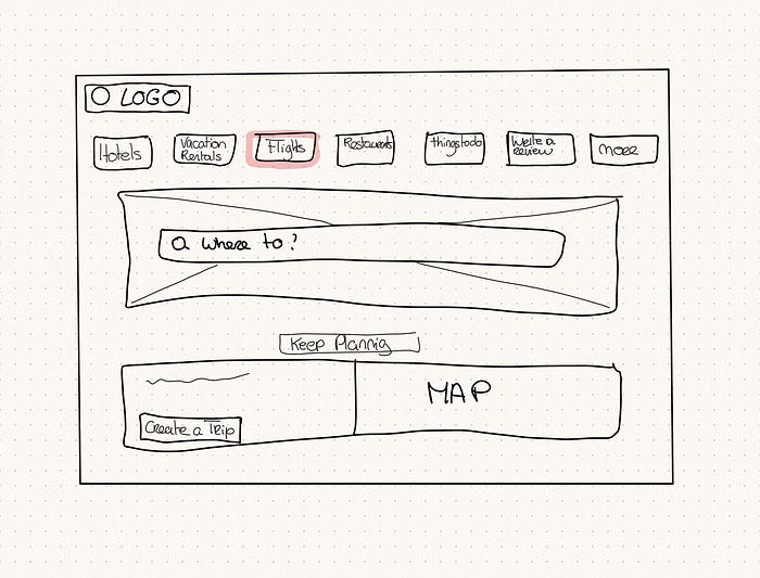
Redesign Wireframes :
Here is the last step of our usability evaluation, how I planned the redesign by doing a wireframe and solved this pain point.
In my opinion, the flight category is very important in order to plan a trip successfully. I think It should appear as a main button alongside hotels. We can remove the « travel forums button and add it in the slide button « more ». Swap « flight » and « travel forum » sections.
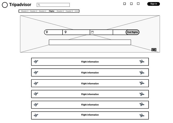
Before the changes, to search a flight on Tripadvisor you had to spend more than 10 seconds and a few unnecessary clicks to have a flight result.
Here is the current user flow to search for flight.
To resolve the two last problems I chose to add a feature to have all information in one page. When we click “Find flights”, results will appear on the same page below. All flight information is quickly available.
What did I learn ?
I really loved and felt inspired by this project. Although, analysing and finding the pain point of a successful website that is loved by users worldwide was very hard and challenging. I learnt so much about usability, how to be flexible and adapt my research to my user when conducting the test phase.
